Tailwind CSS forms plugin: a step-by-step build guide
Introduction
Tailwind CSS is an utility-first CSS framework for productive front-end developers.
If you never heard about it, let me introduce you to the marvelous world of pragmatic CSS frameworks.
In this article, we will learn about its forms plugin, which helps unifying their appearance across browsers and customize them more easily.
What is @tailwindcss/forms?
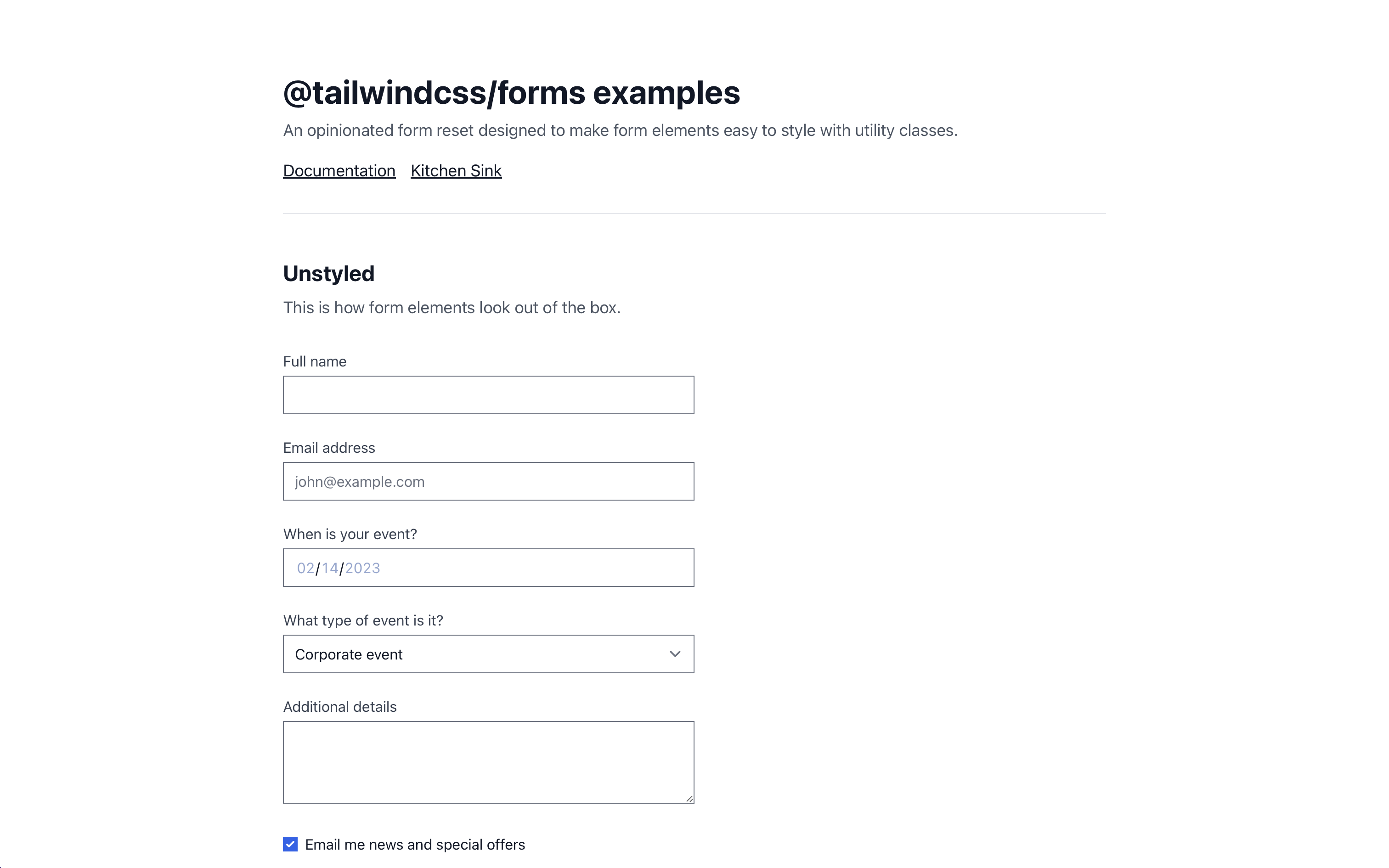
@tailwindcss/forms is an officially provided plugin that resets forms to a consistent state across all browsers and makes them easily stylable.
Installation
The plugin can be installed with this simple NPM command:
npm install @tailwindcss/forms
Or with Yarn:
yarn add @tailwindcss/forms
Then, import the plugin in your tailwind.config.js file:
// tailwind.config.js
module.exports = {
    plugins: [
        require('@tailwindcss/forms'),
    ],
}
Usage in your forms
First, I recommend you try the live demo.
Once the forms plugin is ready, all your forms will have basic styling with accessibility in mind.
Here are all the supported form elements:
input[type='text']input[type='password']input[type='email']input[type='number']input[type='url']input[type='date']input[type='datetime-local']input[type='month']input[type='week']input[type='time']input[type='search']input[type='tel']input[type='checkbox']input[type='radio']selectselect[multiple]textarea
As mentioned in the README on the official GitHub repository, you must at least use type="text" (or any of the types mentioned above for the styles to take effect.
This is a necessary trade-off to avoid relying on the overly greedy
inputselector and unintentionally styling elements we don’t have solutions for yet, likeinput[type="range"], for example.
From now on, you will be able to style select elements:
<select class="px-4 py-3 rounded-full shadow">
    …
</select>
And even change a checkbox color using text color utilities:
<input type="checkbox" class="rounded text-green-400" />
Use classes instead of global styles for your forms
In some cases, you may want to be less hardcore. I’m thinking about existing projects, for instance.
Therefore, instead of applying global styles, you could use the classes provided by the plugin.
| Base | Class |
|---|---|
[type='text'] |
form-input |
[type='email'] |
form-input |
[type='url'] |
form-input |
[type='password'] |
form-input |
[type='number'] |
form-input |
[type='date'] |
form-input |
[type='datetime-local'] |
form-input |
[type='month'] |
form-input |
[type='search'] |
form-input |
[type='tel'] |
form-input |
[type='time'] |
form-input |
[type='week'] |
form-input |
textarea |
form-textarea |
select |
form-select |
select[multiple] |
form-multiselect |
[type='checkbox'] |
form-checkbox |
[type='radio'] |
form-radio |
And to make sure the plugin does not apply the global styles, you can pass parameters when initializing it:
// tailwind.config.js
module.exports = {
    plugins: [
        require('@tailwindcss/forms')({
			// strategy: 'base',
			strategy: 'class',
		}),
    ],
}
Build a beautiful newsletter form
This blog’s user interface has been built with Tailwind CSS, and I make use of the forms plugin.
You may have noticed the form to subscribe to the newsletter on the home page.

Why don’t we recreate it?
Let’s take a look at the few easy steps (live demo on Tailwind Play).
Let’s start with the input field:
<input
    type="email"
	placeholder="homer@simpson.com"
	class="w-full rounded-md border-0 px-4 py-3 placeholder-gray-300 shadow"
/>
w-full, to make sure the input takes the full width.rounded-md, to make the border rounded.border-0, because the Tailwind CSS forms plugin applies a border by default.px-4 py-3, which are padding values (padding: .75rem 1rem) that look right for my form.placeholder-gray-300, because the default placeholder text color doesn’t look right.- And finally,
shadow, which applies a smallbox-shadowthat makes it look extremely cool.
Then, the button:
<button
    class="mt-2 w-full rounded-md bg-gradient-to-r from-purple-300
    to-purple-400 px-4 py-3 font-semibold text-white shadow-lg"
>
    Subscribe
</button>
mt-2, because we need a bit of spacing.bg-gradient-to-r from-purple-300 to-purple-400, for a beautiful purple gradient that starts from the left and goes to the right.font-semiboldfor a slightly bolded text.text-white, which is also self-explanatory.shadow-lg, for a large shadow that makes the button more clickable.